
Preparing materials for digital printing
How to prepare the files for printing to ensure a seamless production process?
Check out our top tips for preparing a book for printing.
Files

Materials for printing should be submitted as pdf files:
- with no layers or transparency (flattened)
- in net size corresponding to the size of the job to print, plus any bleeds
- with a properly defined TrimBox
- with properly set margins
- with embedded fonts.
The file should contain all the pages to be included in the publication, in their running order, together with any blank pages. Do not put any information, such as, e.g. ‘this is a blank page’ or ‘this is an empty page’, on the blank pages.
If the book is split between a number of files, indicate the order of the files clearly and transparently.
See also
Bleeds and margins
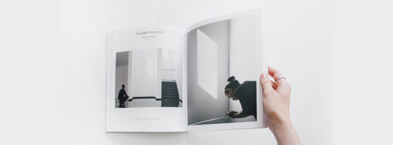
All elements of the design (images, graphics, text, background) that are positioned so they print right to the edge of the page should overlap the edge of the page by at least 3mm. The overlap area is the so-called ‘bleed’.
The design has to allow for bleeds on all four sides of the work.
Margins – All key elements, such as text, codes, logos, etc., should be placed at least 5 mm from the trim line. Avoid using relatively narrow (less than 10mm) borders to go round the pages.
See our video tutorial:
See also
Crop marks
It is not necessary to include crop marks for digital printing. Should they be included, they have to be placed at least 3 mm away from the edge of the page.
Graphics
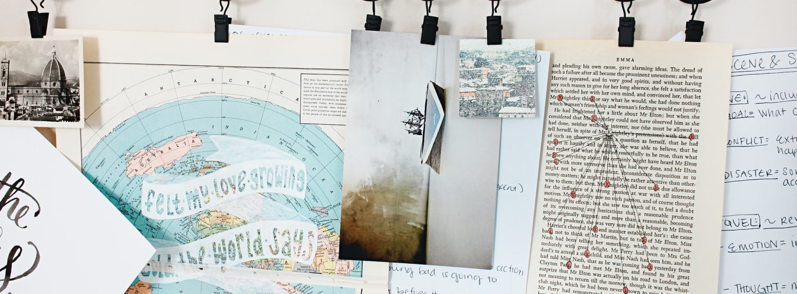
Bitmaps (images) should be submitted with a resolution of 200 – 300 dpi and embedded as TIFF files using lossless compression (LZW, ZIP) or a high quality JPEG. Lower resolution will visibly compromise the quality of the printed material, while higher resolution will unnecessarily increase the size of the file without increasing the quality of the printed material. A low quality JPEG (with a high level of compression) will also adversely affect the quality of the printed material.
As far as scanned materials are concerned, the original’s raster has to be removed (e.g. by blurring it). This will prevent the moire effect from occurring on the printed material.
The minimum width for 100% K and colour lines is 0.4 pt. (0.14mm). The minimum width for grey lines is 0.7 pt. (0.25mm).
For small graphic elements smaller than 1mm, such as dots, lines, etc., it is important to consider the impact of rasterisation on the appearance of the final print.
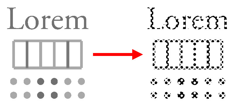
Electrostatic printers (commonly referred to as laser or toner printers) create halftones by printing larger or smaller dots, known as raster dots. The distance between these dots is fixed and typically ranges between 0.15 and 0.2 mm, depending on the machine. When viewed from a certain distance, the raster gives the illusion of a uniform surface. However, small or thin graphics may become distorted. Tiny elements can lose their shape, straight lines may appear wavy or even broken. This issue also applies to small text, where the edges may appear uneven or jagged.
This problem does not occur with graphics at 100% coverage (where rastering does not take place) or with inkjet printers due to their different rasterisation methods.
See also
Fonts
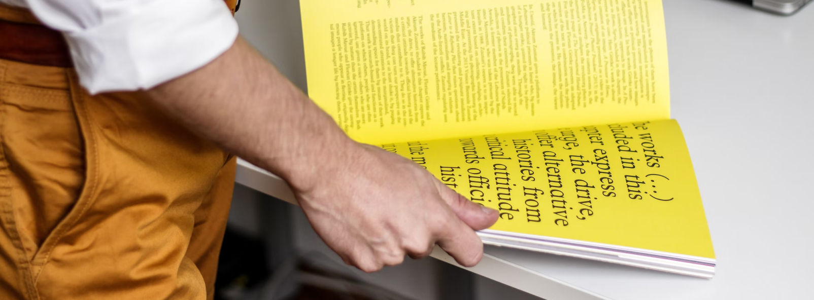
All the fonts used must be embedded in the PDF file submitted, or – as a last resort – convert all text to vector outlines. The latter solution causes the file to significantly increase in size and complexity, therefore it should only be applied only when there is no other option.
Fonts below 12 pt. should be in colours with 100% saturation of the channels used (100% K or 100% M and Y).
Colours

PDF files to be printed should not include ICC profiles. If included, they will be disregarded in the printing process.
The correct colour mode is CMYK. It is possible to use the RGB mode for images, however, the colour of the print may differ from the file/preview/pattern sent for printing.
It is possible to use Pantone colours, if correctly configured. The colour name in the file must match the expected colour in the printout.
For special colours you are required to choose one of the following methods:
- original Pantone (offset print)
- Pantone simulation from CMYK (digital print)
- Pantone conversion to CMYK (digital print).
Please note that CMYK-based Pantone simulation results in colour differences compared to the original colours. The use of this method is limited to the standard colour library only. Metallic, fluorescent or pastel colours cannot be obtained.
If you do not provide information about extra or special colours in the production file, Pantone simulation from CMYK will be used in the printing process, according to ISO standards and considering the substrate profile.
Elements that are to have the same colour on the printed material must have the same colour mode.
Do not set white elements to overprint. Those elements will not appear on the printed material. Fine, light-coloured elements (e.g. text) should not be placed on dark background printed as an amalgamation of numerous components. Do not use elements in Pantone colours with transparent effects covering other objects or objects with transparent effects covering elements in Pantone colours.
It is not correct to use incomplete colour modes, e.g. CMY without the K channel, etc. If it is important to keep to a specific colour code, then submit a template or provide us with a Pantone colour reference number as close to the target colour as possible.
Illustrations in black have to consist only of the color black. We do not allow CMYK or RGB components.
Book block (interior pages)
Interior pages should be submitted as a PDF file or files containing free-standing pages including all blank pages.
If your interior pages are split between a number of files, remember to indicate the correct order of the files clearly and transparently. The page sizes and margins within the file should be the same as the page sizes and margins in the book and allow for the required bleeds.
If there are any pages that are to be printed in colour (e.g. as inserts), clearly and transparently describe their position within the book as per the folio, or – better still – as per the order of pages within the book.
If changes/corrections are to be made in the files already submitted for printing, the pages where the changes/corrections have been introduced should be sent to us in the form of separate PDF files (one file per page) or in the form of a file containing the entire book with the changes/corrections introduced.
The number of interior pages for sewn binding is always a multiple of 4, while for perfect binding it is a multiple of 2, 4, 6 or 8 – depending on the format and machine used.
With sewn binding, the positioning of inserts printed on a paper different than the rest of the book is not entirely unrestricted and will depend on the setup of the book’s sections. This does not apply to single sheets glued in between the interior pages.
Cover & casewrap

Submit your covers as a separate PDF file using the general guidelines for preparing your materials for printing. Prior to preparing your cover/casewrap, ask our sales representative/one of our customer service staff to provide you with a drawing and determine the thickness of the spine for you.
Book spines narrower than 6mm cannot contain text or graphics, such as e.g. company logos.
All text and graphics on the spine should be placed at a distance of at least 1.5mm from the joint (edge of the spine).
For aesthetic reasons it is better not to place any text or other free standing elements at a distance of less than 5mm from the spine (due to the joint placed there).
See cover template →
Softcovers
If the cover’s inside pages are to be printed on, the spine is to be left white + 5mm on each side of the spine for side gluing.
Hardcovers
See casewrap template (flat spine) →
See casewrap template (round spine) →
It is worth checking how to correctly design the cover and dust jacket for the given book. Preparing the files for printing properly will prevent errors and having to send the design back for modifications following the technological verification in the printing hall, thus reducing the time necessary to produce the book. We have put in place a tool that allows our customers to calculate all the parameters needed to create the right design by themselves. All you have to do is to provide the details for the printing job, such as the number of pages and the type of stock and covers; the calculator will automatically set all the parameters.
Check template of cover/casewrap of your publication→
Enhancements
Spot UV coating
The mask for spot UV coating should be prepared and submitted as a separate file. All coated elements must be in one, 100%, colour.
Hot foil stamping (hotstamping)
The mask for hot foil stamping should be prepared and submitted as a separate file. Use only single-colour vector elements not less than 0.4mm in width and placed at a distance of not less than 0.2mm from each other.
As with UV varnishes, hot-stamped elements must be marked with one single colour 100% in value.
Dry stamping
The mask for dry stamping should be prepared and submitted as a separate file. Use only single-colour vector elements not less than 0.5mm in width and placed at a distance of not less than 0.2mm from each other.
Embossing (both hot-stamping and dry concave and convex embossing) cannot be applied on or along crop marks, hinges, flaps, or creases.
Please note, the graphic design for all refinements must be prepared as part of the drawing for the cover and other parts of the book that are to be refined (taking into account the correct placement of all additional elements and respecting the suitable formats and margins).
Centring enhancements on covers
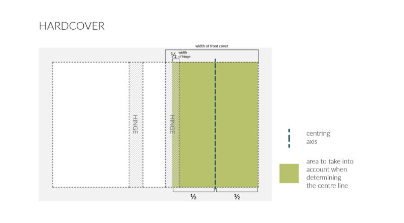
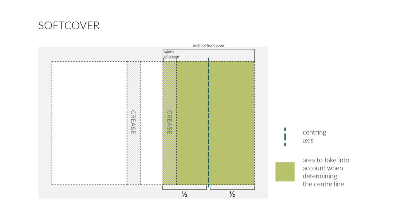
The centring of enhancements on covers, i.e. their even placement aimed at achieving the bests possible optical and aesthetic impact, is a matter of individual taste determined by the artistic intention of the cover’s designer. However, there are several rules that we recommend are observed to achieve the best visual effect.
- where hardcovers are concerned, the embossing/varnishing design should take into account the width of the first page of the cover minus 1/2 of the width of the hinge:
- for softcovers, the embossing/varnishing design should take into account the entire width of the first page of the cover – all the way to the spine, remembering that enhancements such as hot-stamping and dry embossing cannot be applied on or along creases or crop marks:
See also
3D Touch enhancements

3D varnish
3D varnish made using digital technology imitates raised varnish applied using screen printing technology.
All elements to be enhanced with 3D varnish must be marked with a single, 100% black, colour.
As far as 3D varnish mask files are concerned, you can include elements with a thickness of at least 0.25 mm, with a minimum distance between them of 0.6 mm. 3D varnish cannot be applied along cropmarks, creases or on flaps.
As regards designing texts, the font used should not be less than 8 pts.
To achieve the best 3D varnish effect, we recommend applying Soft Touch foil coating over the entire area to be enhanced. If this type of foil is used, the text font to be enhanced using the 3D varnish must be of a minimum size of 6 pts.
2D varnish
2D varnish made using digital technology imitates flat varnish applied using screen printing technology.
All elements to be enhanced with 2D varnish must be marked with a single, 100% black, colour.
As far as 2D varnish mask files are concerned, you can include elements with a thickness of at least 0.25 mm, with a minimum distance between them of 0.6 mm. It is possible to apply 2D varnish along cropmarks, creases and on flaps.
As regards designing texts, the font used should not be less than 8 pts.
When applying Soft Touch foil coating on your substrates, the text font to be enhanced using the 2D varnish must be of a minimum size of 6 pts.
Foils
All elements to be embossed with foil must be marked with a single, 100% black, colour.
Where foil is to be applied, only elements with a thickness of at least 0.25 mm can be included (save for foil embossing to be applied on cardboard that has not been coated first – a thickness of at least 0.6 mm is required here), with a minimum distance between them of 0.6 mm.
As regards designing texts, the font used should not be less than 8 pts.
When applying Soft Touch foil coating on your substrates, the text font to be enhanced using foil embossing must be of a minimum size of 6 pts.
Available foil colours: gold, silver, red, navy blue, black, holographic (laser and dots). Should you wish to apply a colour different to what is offered by Totem on a regular basis, we will be happy to put a special order in for you.
Templates and masks
Please note that all graphic designs for any type of enhancement should be prepared using the same layout (template) as the cover — taking into account the correct positioning of additional elements, and maintaining proper sizes and margins.
Mask files for each enhancement (2D and 3D varnish, foils) must be prepared as separate files. Each file should be clearly named, for example: (project name)_3Dvarnish.pdf, (project name)_2Dvarnish.pdf, (project name)_foil_(foil color).pdf).
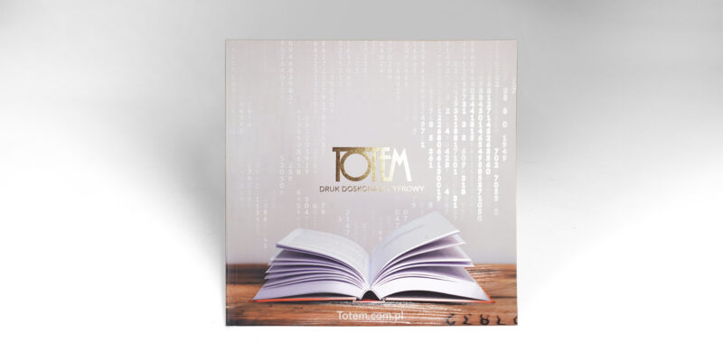
This company catalogue is an example of how it can be done:
Catalogue cover_print File for printing
Catalogue cover_2D varnish Flat varnish (2D) mask file
Catalogue cover_3D varnish Raised varnish (3D) mask file
Catalogue cover_gold foil Foil mask file (gold foil in this case)
See also
Book edge printing
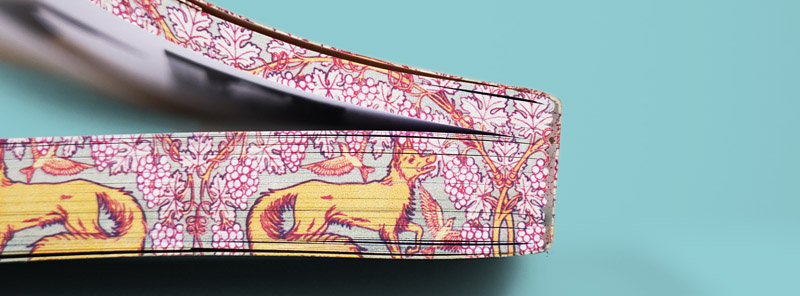
Block edges can be printed essentially in all types of books, whether they are hardcovers or paperbacks, with flaps or rounded corners.
Files for book edge printing must be made in CMYK and saved in a pdf format. For each edge a separate file must be prepared and properly named (e.g. edge printing-top.pdf, edge printing-side.pdf and edge printing-bottom.pdf). The width to be printed must be the same as the width of the block (use our Cover generator to find it).
The edge print design should allow for 2 mm bleeds on each side.
The minimum book size for edge printing is 80 x 80 mm, and the maximum is 450 x 450 mm.
When ordering, attach a file with a visualisation of the book with printed sides, showing the front cover as well.
If you wish to have continuous artwork on a number of volumes or parts in a series of books, prepare one file for each book edge of your publication.
Figures below show how to prepare your project.
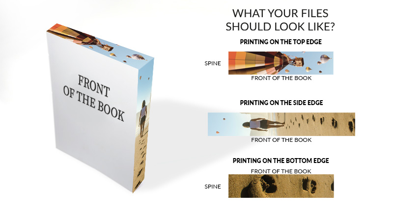
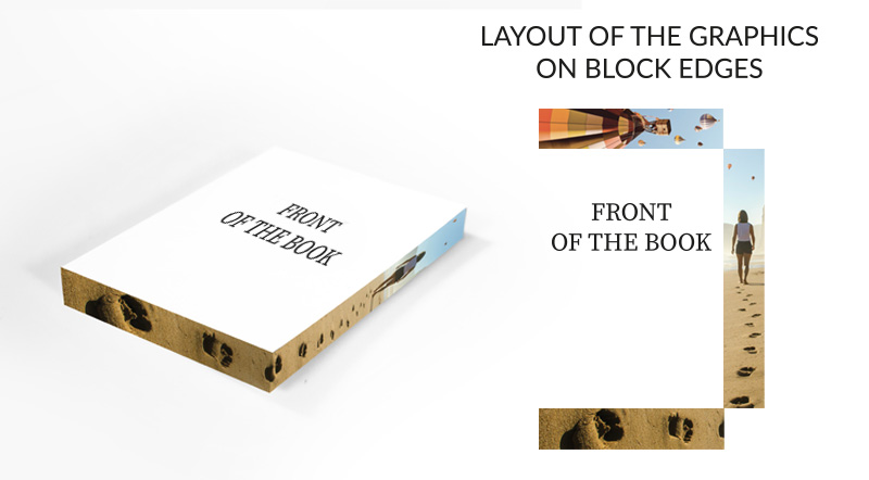
If the top and bottom edge of the book is to be printed, it is important that each graphic element intended to be closer to the book spine is located on the left of the spine in your project.
If you want to have the side of the book block printed, the left of your layout should show the top graphics.
Note!
1. Edge printing will not include the area of the block with graphics in the bleed section. That is why we do not recommend printing edges where the graphics inside the book touch the edges. To avoid possible defects, we suggest moving the graphics away from the block edges if you wish them printed or stained.
2. Where the book block has rounded corners, a certain offset and fuzziness of the printed artwork may occur at the corners.
3. If your design forms a continuous layout across all three edges (where the image flows smoothly over the corners), please let our Customer Service Department know when ordering your book.
Prepress checklist

1. The printing house verifies the correctness of the materials prepared for printing:
- verification of completeness of the materials prepared for printing (files),
- compatibility of the format of the materials with the parameters of the order,
- compatibility of the number of pages to be published with the parameters of the order,
- verification of spine width and bleeds within the soft cover/casewrap,
- correctness of positioning of inlays and inserts,
- correct embedding of fonts,
- verification as regards correct preparation of materials for:
– spot coating,
– embossing,
– blanking dies, - verification of bitmap resolution,
- verification of line width,
- correct positioning of crop marks,
- verification of cover graphics against the fixed elements of the binding:
– open creases in soft cover,
– hinge in casewrap,
– flap creases,
– margins, - random checks in respect of 100% saturation of black texts,
- detection of white underprint elements,
- presence and correctness of bleeds.
2. The printing house is not liable for any errors resulting from improper preparation of print materials, including:
- use of transparency,
- use of hidden layers in the file,
- incorrect pagination,
- incorrect blank page location,
- incorrect preparation of split pages in the content,
- misalignment or insufficient margins on covers, as indicated by the printing house in the technical layout,
- positioning of objects and texts,
- incompatibilities in assigning ISBN numbers,
- colour reproduction during printing without colour sample,
- colour reproduction while using colour materials on pages printed in black,
- colour reproduction and the end result following selection of unsuitable substrate,
- incompatibilities in colours resulting from to use the RGB mode in the file for printing,
- differences between expectations and the final result due to the impact of rasterizing on print appearance,
- spelling, grammar and editorial errors within the content,
- missing graphics, text or other features due to file formatting by means of TEX, Apache FOP (or similar automated typesetting tools),
- aesthetic aspects of the completed project.
Still a little confused?
If anything else needs to be clarified or you want more guidance, contact us and we’ll be happy to help. We’re open Monday through Friday 8.00 - 16.00.